Case Study:
Capital One Mobile App Redesign
Redesigning the Capital One mobile banking app, bringing focus to users spending habits and usable features.
Role:
UI Designer
UX Researcher
Team:
Self-Directed
Timeline:
60 Hours
Deliverables:
Redesigned App
Capital One Component Library
Background
As a frequent user and (pretty consistent critic) of the Capital One app, I decided it would be fun to try my hand at recreating their UI and expanding on some of their features to make them more intuitive. The current interface of Capital One feels repetitive, some features feel irrelevant, and others don’t even work.
The challenge in revamping the Capital One app was determining which existing features remain important, identifying new features to make the app competitive with other banking apps, all while maintaining Capital One’s distinctive UI.
Research
I extensively studied the Capital One app, its features, and its UI. I also partook in some market research by looking into other bank apps and their features. And most importantly I conducted a survey that asked individuals about what features were important to them on a bank app, and what they feel like they’re missing out on.
Survey
The survey I conducted revealed that only one-third of participants receive any form of data providing insights into their spending habits. Additionally, only one individual who did receive a spending analysis felt it was accurate…Spooky!
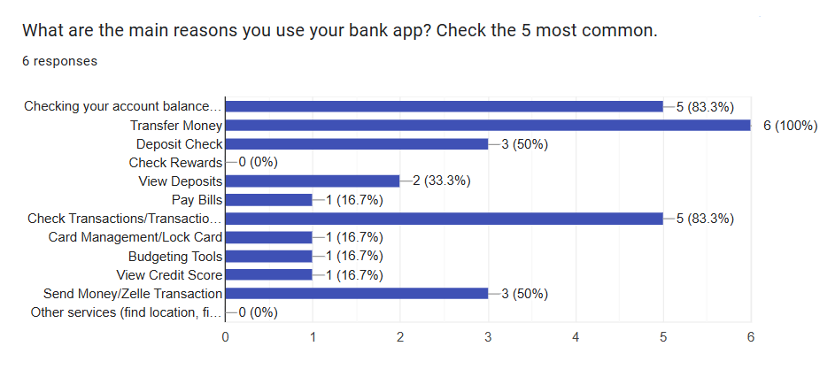
The survey also highlighted which features are most utilized in banking apps. For instance, "Bill Pay" is rarely used, while money transfers are considered essential. Furthermore, users expressed strong negative opinions about banking apps integrating chatbots or assistants, finding them universally disliked and deemed useless, when present.
Creating a UI database
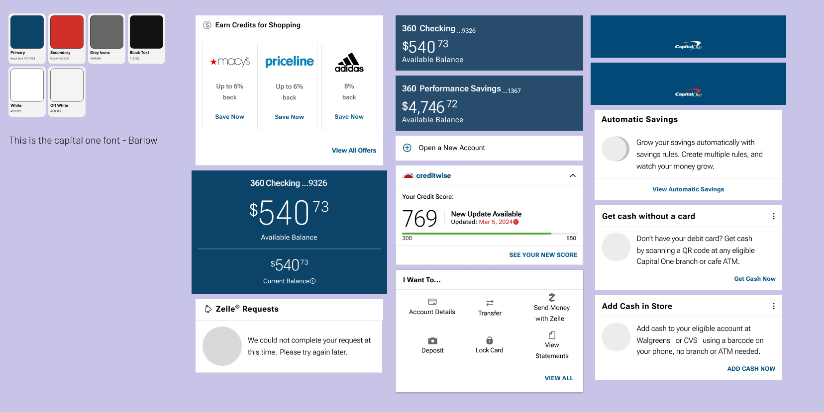
One of the most time-consuming aspects of this project was meticulously recreating Capital One's existing UI components for my own use. Building this accurate component library was essential to ensure that the new features I designed would integrate seamlessly into the existing framework. This attention to detail not only streamlined the design process but also resulted in a comprehensive UI library, a key deliverable of this project.
Disclaimer: I did not create the original branding or UI components for Capital One or their mobile app. The designs were meticulously recreated solely for the purposes of this project to ensure consistency with the existing application.
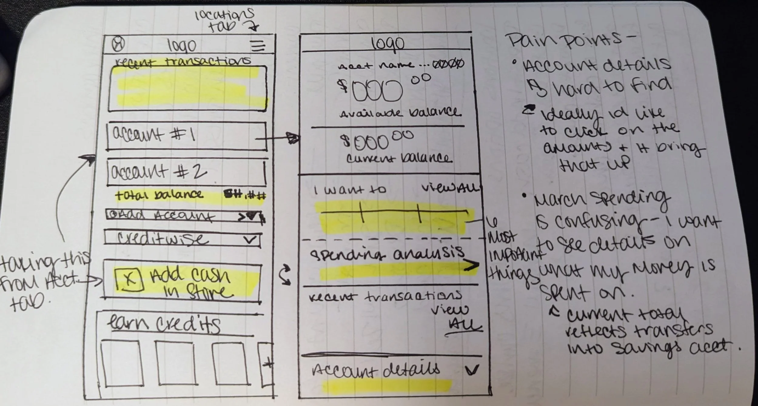
Sketching
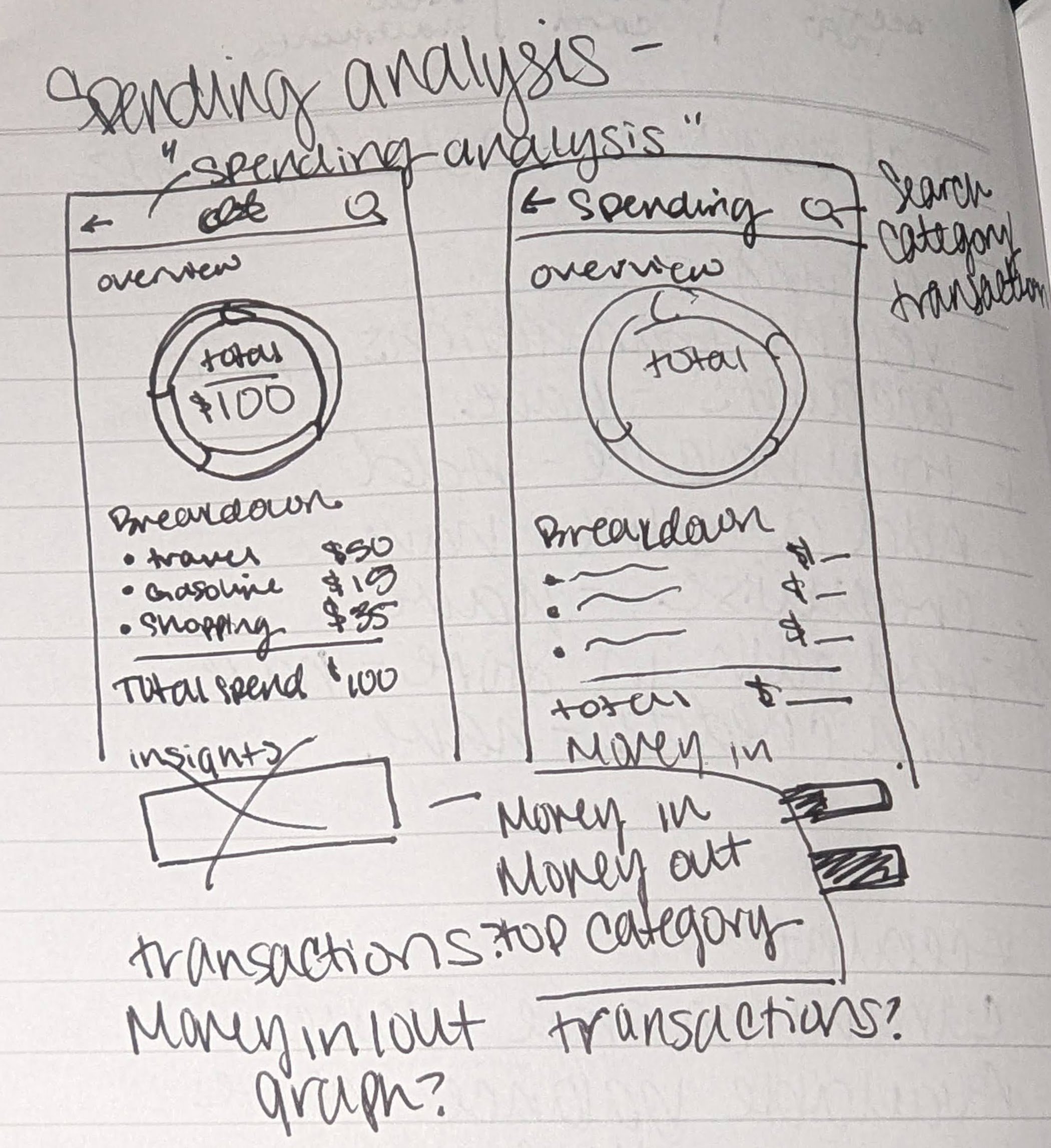
Most of the sketching I did consists of simply reprioritizing existing elements, and (Re)moving other elements that were repeated throughout the app to a spot that ensured proper hierarchy and aligned with the focus of the page.
Updated Pages
After
Before
Before
After
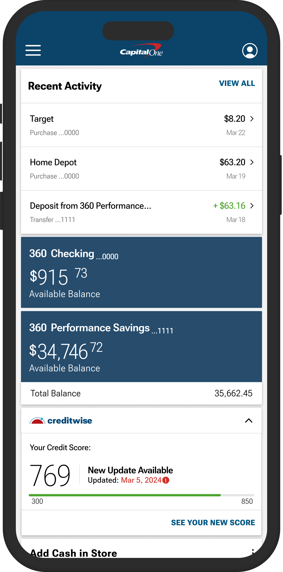
#1 Home Page Hierarchy Change
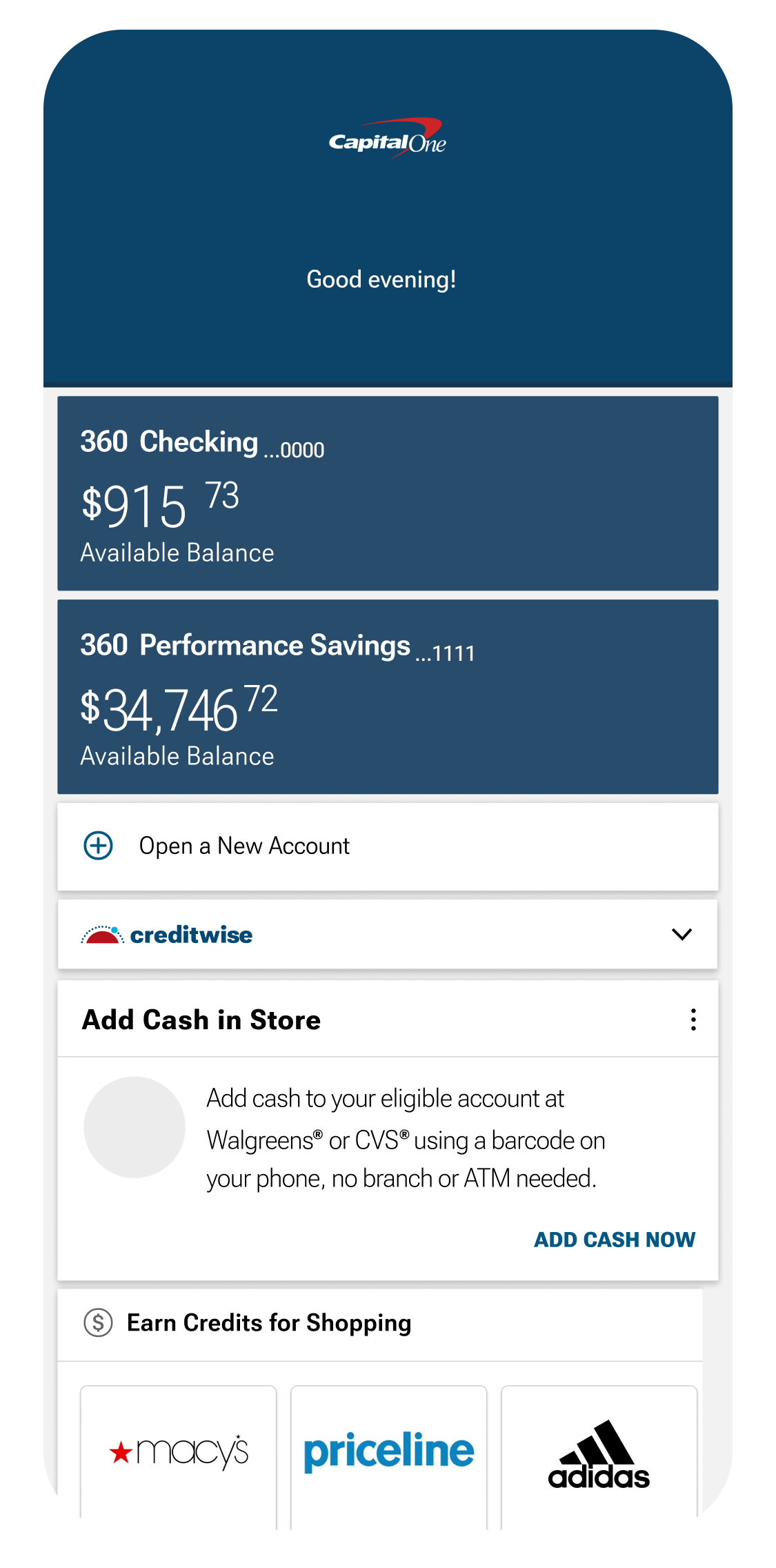
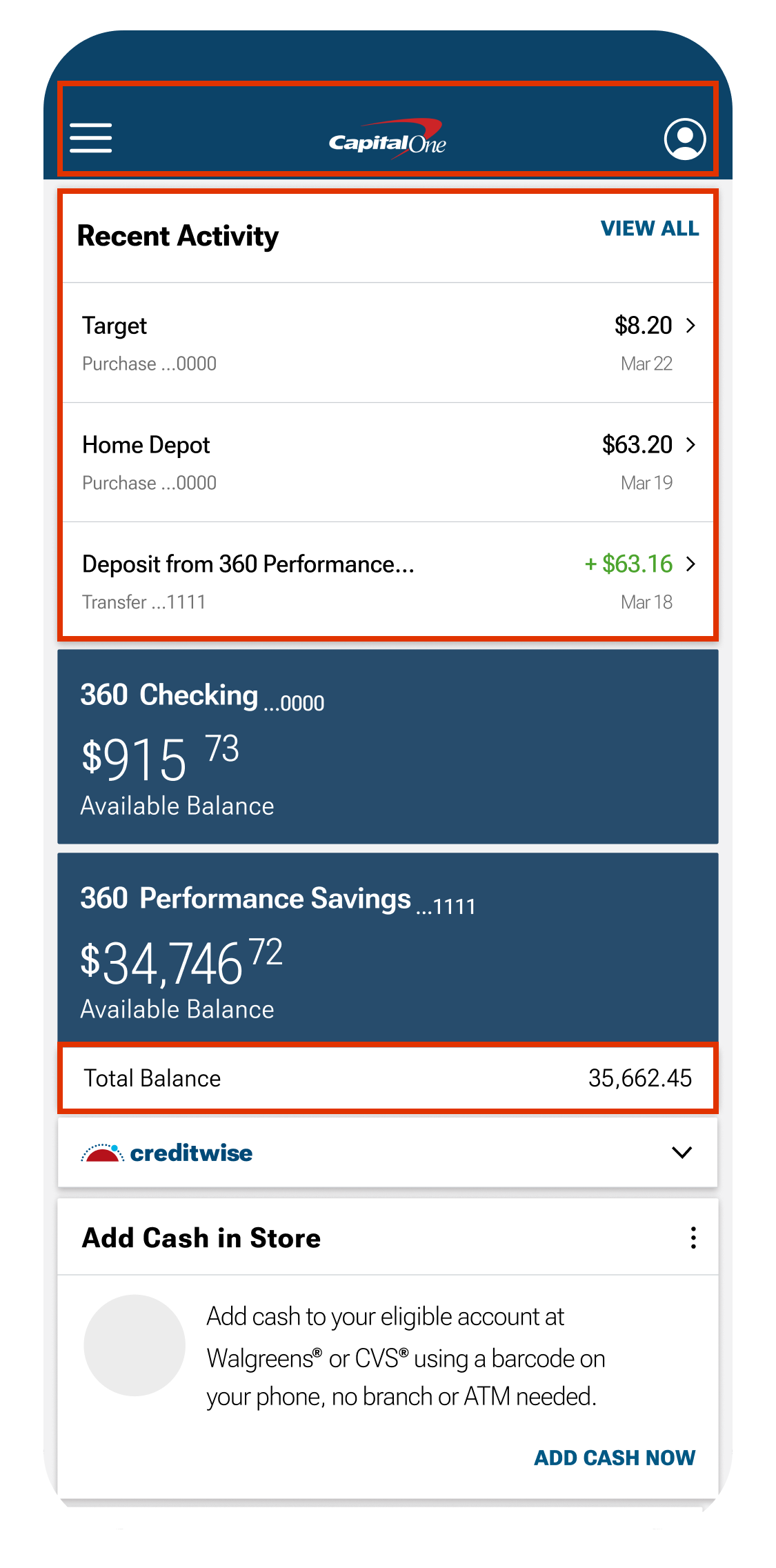
Research identified opportunities to enhance the hierarchy on the home page. Reducing the size of the navigation bar and repositioning menu options to the top of the page created a more intuitive layout. Placing recent transactions prominently at the top and adding the total balance section to the bottom were strategic feature additions, designed to help Capital One better compete with other banking apps in the market.
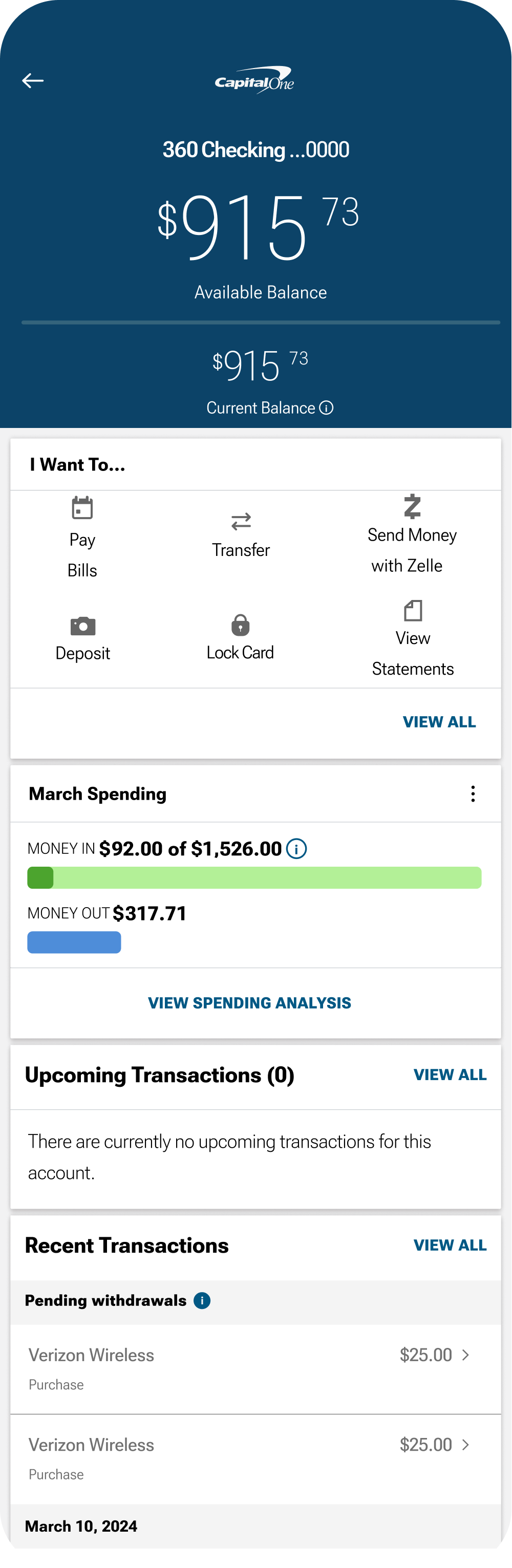
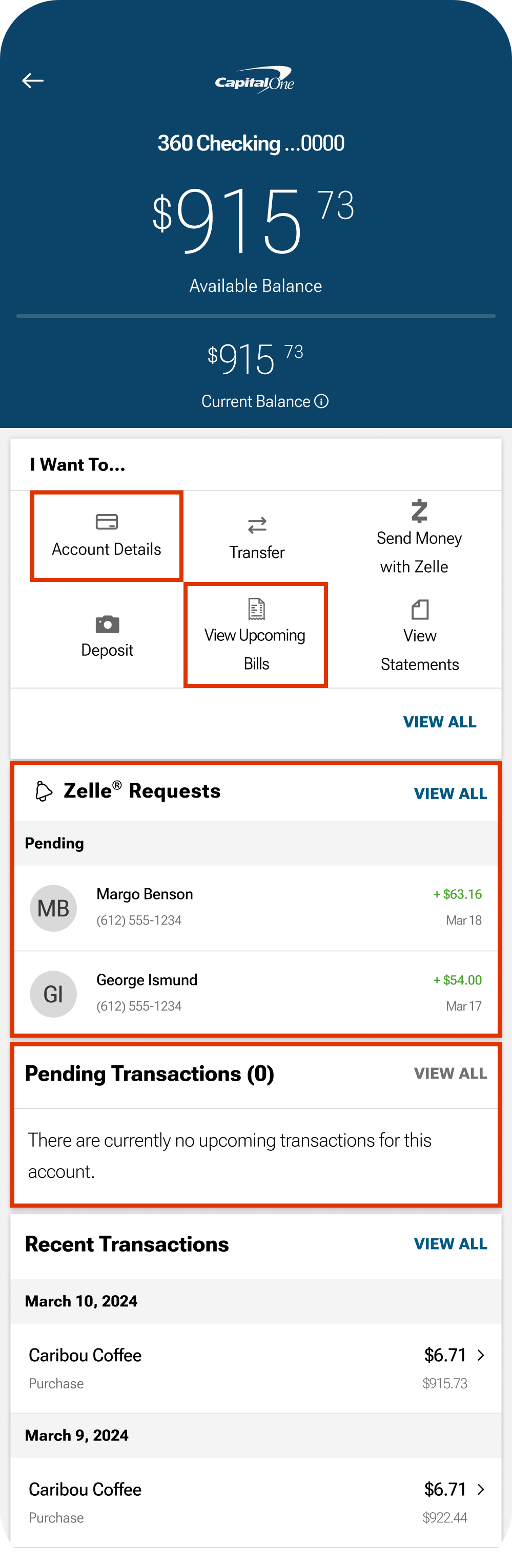
#2 Checking Account Feature Repurposing
Research also highlighted which checking account features were most valuable to users. Based on these insights, I replaced the 'Bill Pay' feature with 'Account Details,' which had been buried further down the page. I also transformed the 'Upcoming Transactions' section into a 'Pending Transactions' section, as the original was closely tied to the Bill Pay feature. Additionally, users of Zelle can now easily view recent transfers or requests, enhancing the overall user experience.
Feature Addition
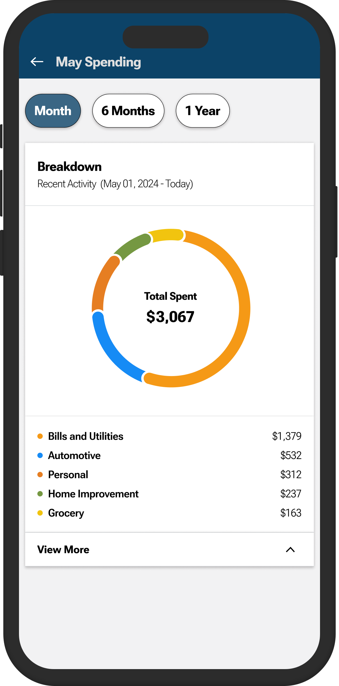
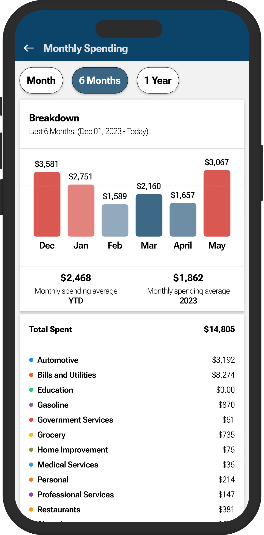
The most important thing I added to the Capital One app was a comprehensive spending analysis. This analysis offers a detailed list of spending categories, and averages the users spending across 6 months and 1 year.
…………
This spending analysis allows users to view their top 5 spending categories, as well as a more detailed view below!
…………
The 6-month feature lets users see their spending for the last 6 months in detail and averages.
Reflections
I've realized that disliking something gives you the power to change it, or at least make an attempt. This project has been a great learning experience in terms of developing and updating features within a set branding guide.
Next Steps
The first phase of the redesign is complete. The app's UI and feature hierarchy have been significantly enhanced, improving both user experience and functionality. Next steps include user testing and implementing changes based on findings.
The second phase will involve a total design revamp. Some aspects of the current UI are starting to show their age, especially when compared to other banking apps. This phase will focus on refining existing features and introducing exciting new ones. I'm looking forward to building upon what I've already accomplished and infusing Capital One's branding elements with my own creative spin.
Previous
Go Oil MVP App

Next
Fat Nats Eggs Responsive Website