Case Study:
Spotify Feature Addition
Spotify, the leading music streaming service, aims to maintain its top position. To enhance its reputation, I integrated a song search feature.
Role:
UI Designer
UX Researcher
Prototyping
Team:
Self-Directed
Timeline:
80 Hours
(4 Weeks)
Deliverables:
Mobile and Desktop High-Fidelity Wireframes
Prototypes
Background
While Spotify's app is well-designed, the constant switching between Shazam and Spotify to discover and utilize new music in the moment became inconvenient.
The challenge in adding a song search feature was to seamlessly integrate it into Spotify's existing UI while ensuring it felt like a natural addition to the app.
Research
I conducted comprehensive market research, competitive analysis, and user interviews to gather valuable insights into the preferences and success drivers of individuals using Spotify and Shazam. My goal was to pinpoint the features that current users like, dislike, and wish for.
User Interviews
I interviewed four individuals aged 18-21, who represent a portion of the primary demographic for these platforms. After researching features offered by Spotify and Shazam, I tailored my interview questions to explore their advantages and drawbacks.
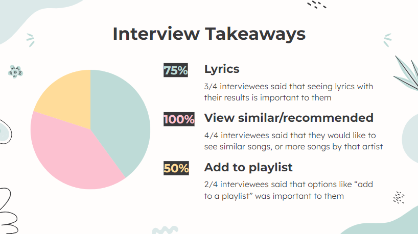
Interview results highlighted that most users expressed interest in features such as: viewing lyrics alongside their search results, discovering similar or recommended songs, and seamlessly adding search results to a playlist.
User Flow
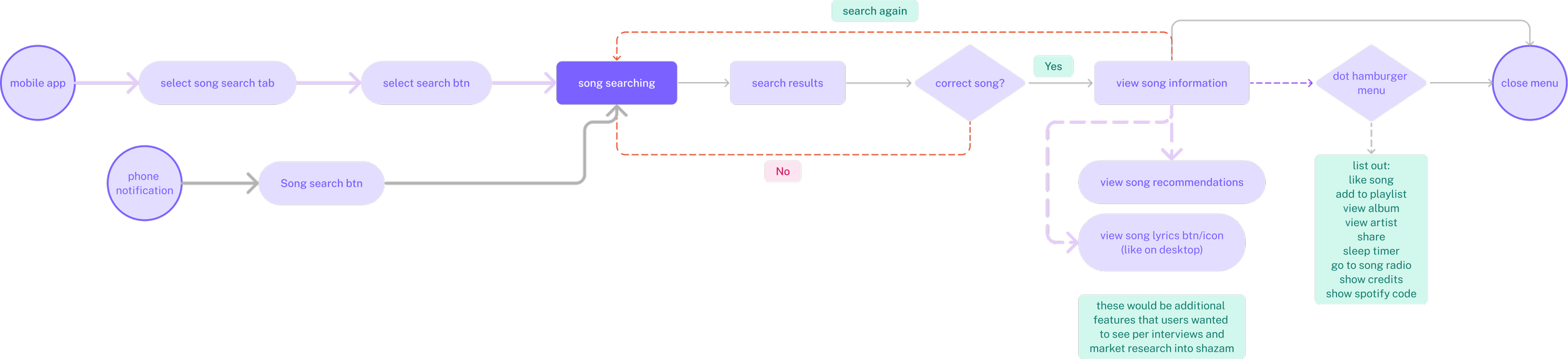
Using the information I gathered during interviews, I created a user flow that incorporated the new song search feature into the existing app. Throughout this process, I prioritized the compatibility of the new addition with Spotify's existing features to create a harmonious addition. This involved thoroughly examining how the new feature would align with the app's overall layout and how existing functionalities would carry over.
Sketching
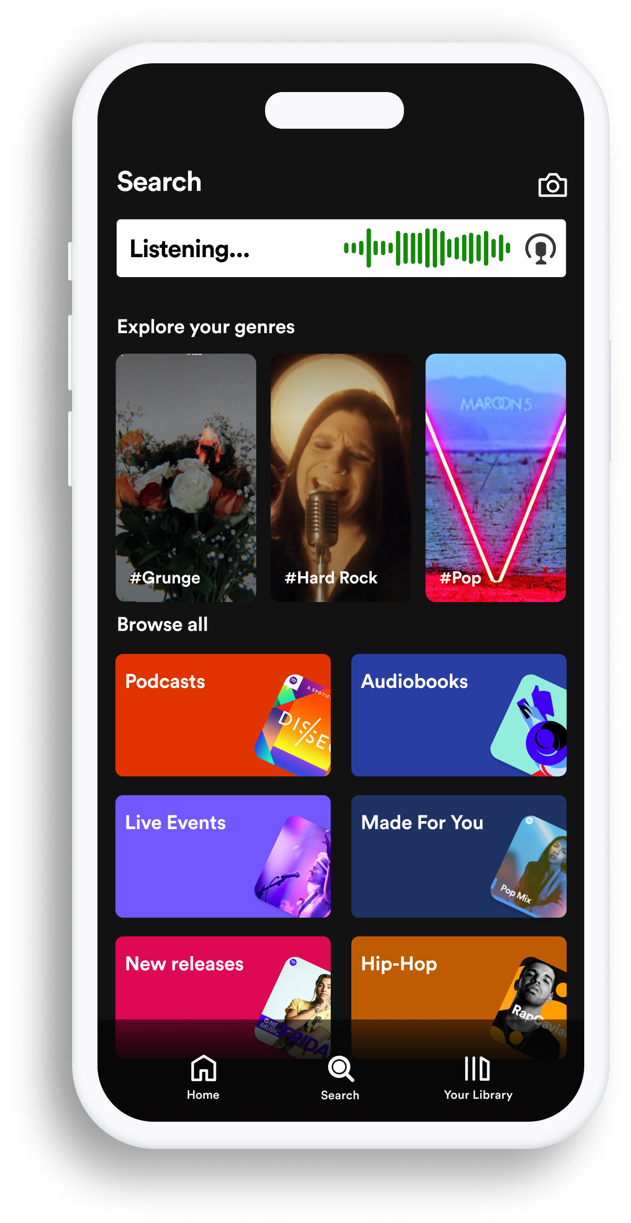
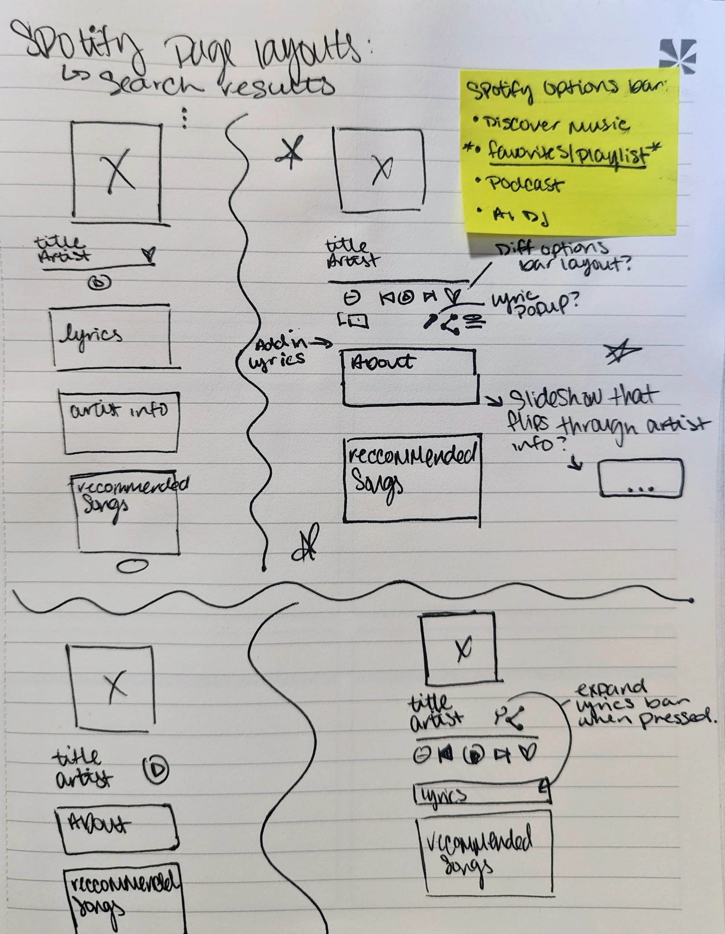
I sketched potential layouts for the results page on Spotify, taking into account its varying layouts based on user activity. After careful consideration, I opted for the results page designed for when the user is listening to their favorite songs, as it was the most intuitive selection. However, I also incorporated a "recommended songs" section at the bottom of the page to align with the insights gathered from my interviews.
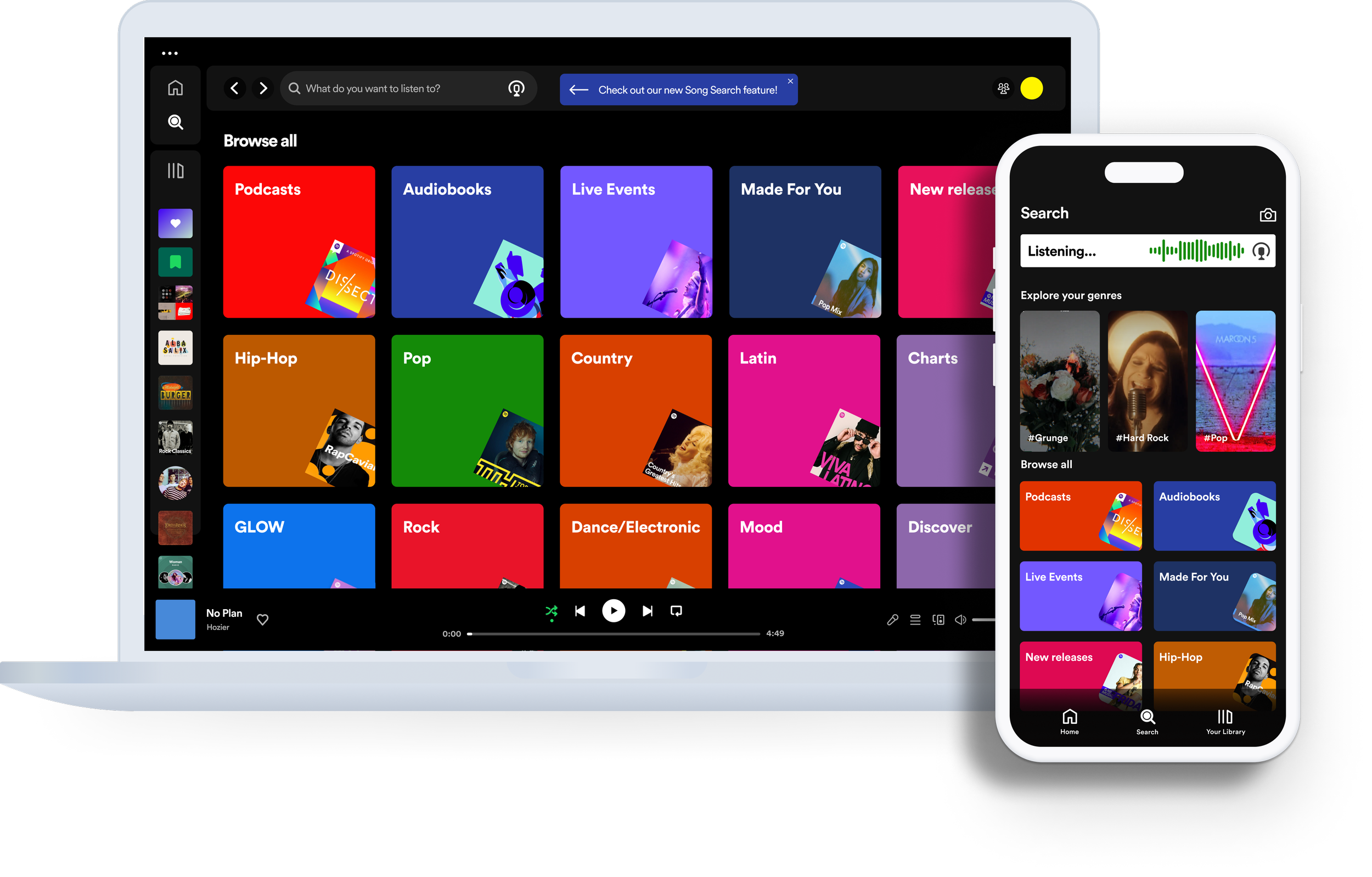
UI Solutions
One of the major hurdles in this project revolved around designing an icon that effectively conveyed its association with a song-search feature. Below, you'll find iterations of the search screens I developed.
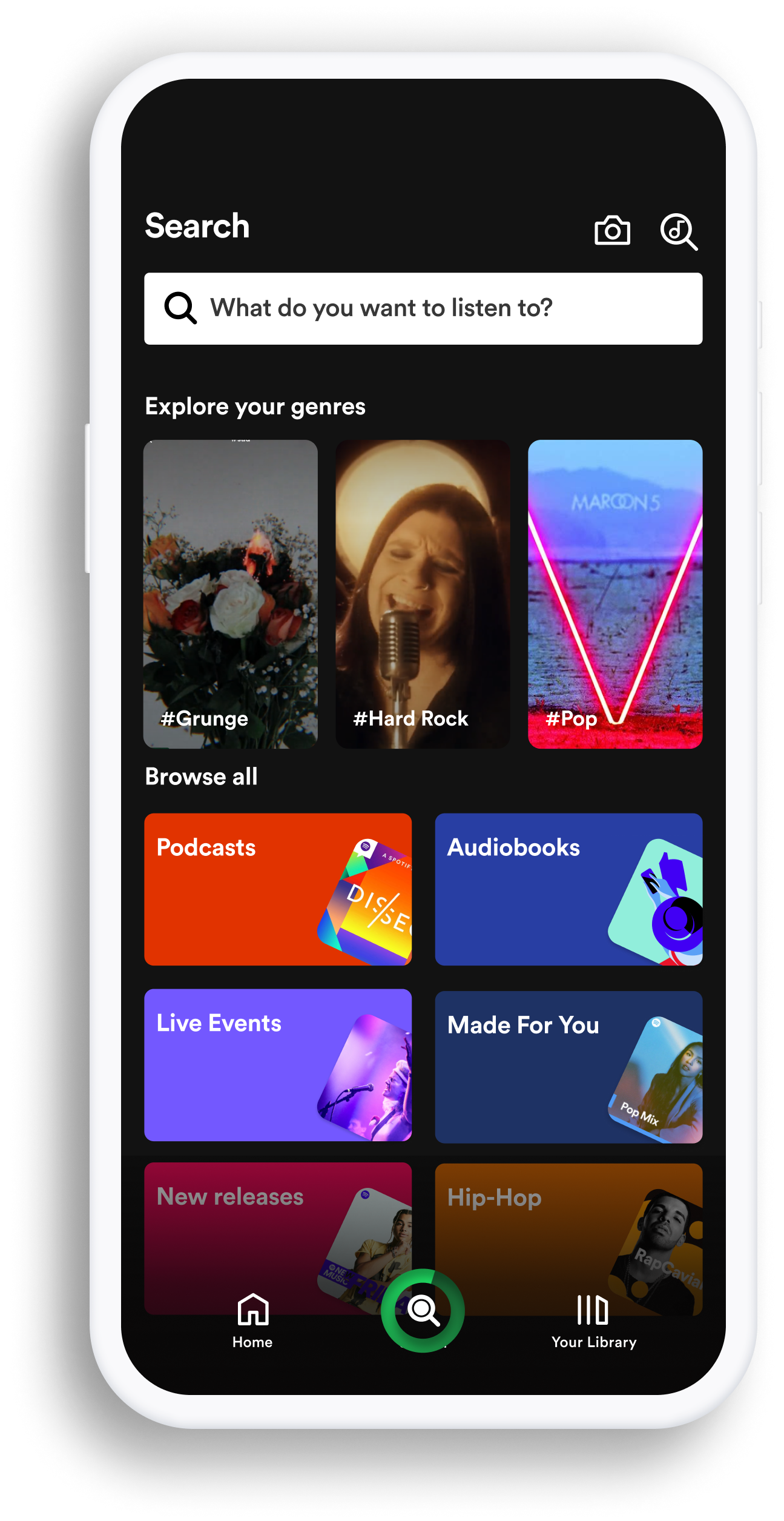
Version 1
…………
I experimented with a search icon with a music note inside during my first round of high-fidelity wireframes.

Version 2
…………
However, after some peer review I eventually settled on including a microphone icon into the search bar for better visibility and usability.
User Testing
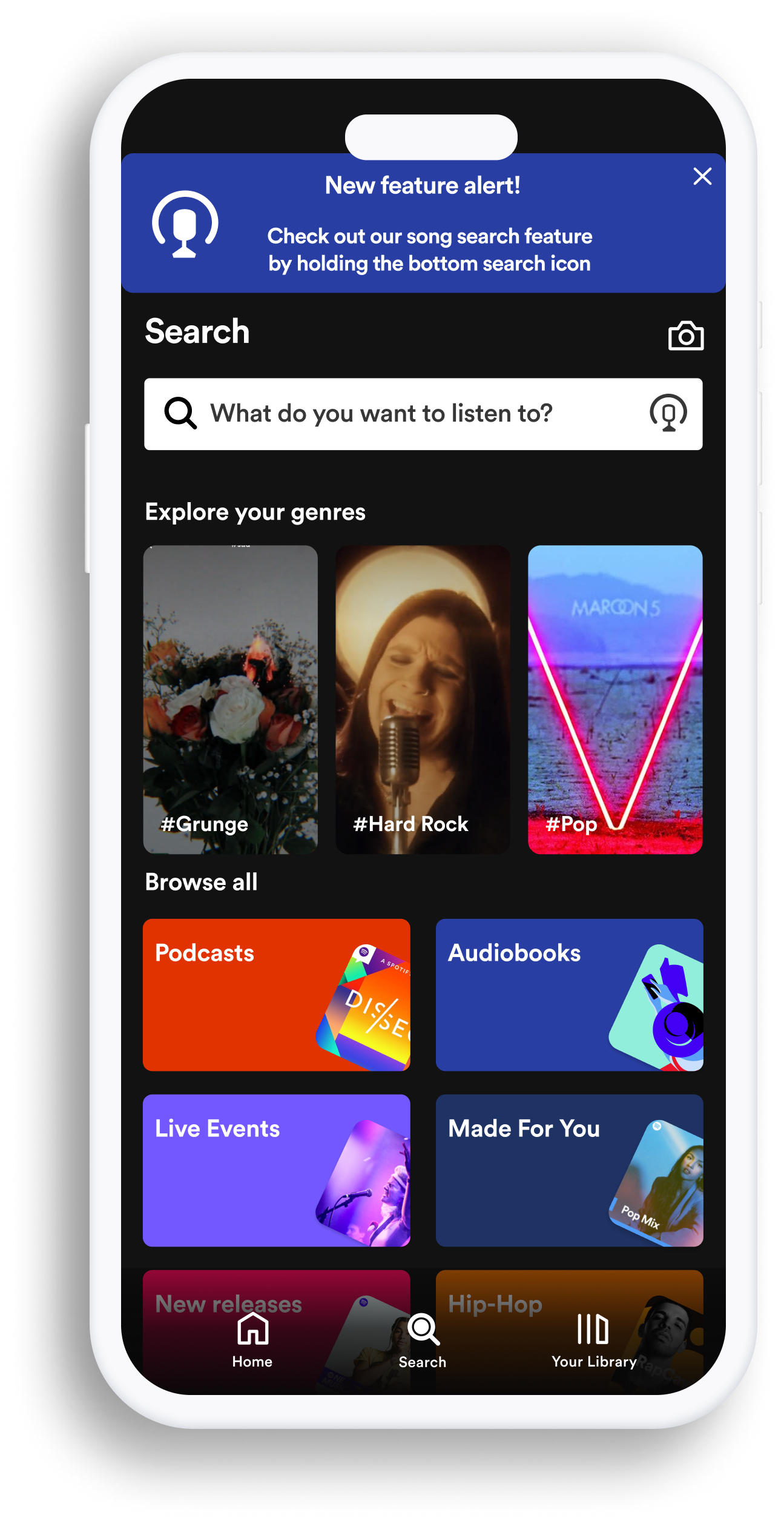
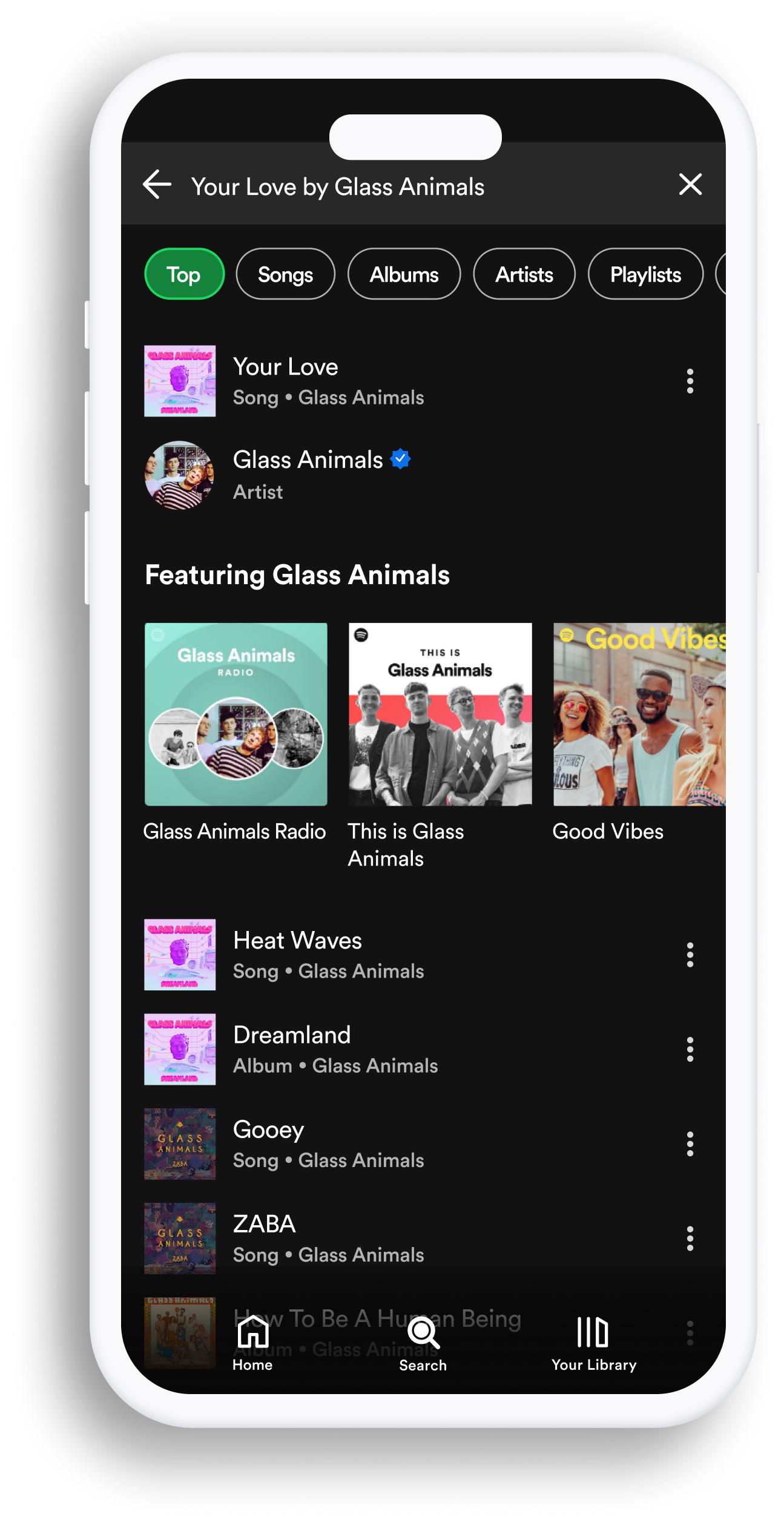
As my project neared completion, I conducted user testing on my high-fidelity prototypes to demonstrate the new feature's functionality. Feedback included adding a banner or notification modal to guide and inform users about using the new feature, adding a dedicated search results page for songs with multiple versions, adding the song title in the search results bar, and changing some phrasing to improve clarity.
My mentor also provided helpful insights when discussing the impact of the “song search” icon, and how it could be improved to better align with Spotify’s established style and functionality.
Quotes:
“There is a lot going on in the search bar. And how this feature is presented isn’t intuitive enough. Maybe you could add a banner or something to present the new feature to the user in Spotify’s style” - Mel
“The microphone icon better represents the new feature than the ‘search-note’ icon. I would also recommend adding the song title in the search bar on the results page” - Elena (facilitator)
“change phrasing from ‘recommended songs’ to ‘songs like this’ or ‘similar songs’ to improve clarity” - Jennifer
Main Flow
01
Search Page

02
Listening
03
Results
Outcome
Throughout this project, I gained insights into the challenges of introducing a new feature to an application with an established UI and branding, while not limiting my own creativity. It also emphasized the value of peer review. To further improve this project I would focus on the impact of additional features that were discussed in my user interviews; such as auto-creating a playlist for song search results, as well as polishing up the “search screen” for improved user interaction.
Previous
Go Oil MVP App

Next
Fat Nats Eggs Responsive Website